Composition
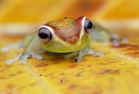
In general the same "rules" apply to image composition in macrophotography as to all other genres of photography. The basis is the golden ratio, or simplified the rule of thirds, in which the image is divided horizontally and vertically into three equal parts with imaginary lines and the most important image content is placed on one of the intersection points. With living motifs, the focus should always be on the eyes in order to convey a "correct" picture impression. If the scene to be photographed has a "direction" in the form of viewing direction or movement, a little more space should be left in this direction to give the picture enough space. Don't lose sight of the surroundings. Pay attention to lines and structures that create tension or guide the gaze and the surrounding colors. A picture can often be "improved" by a suitable choice of perspective, or one waits until the one shadow runs correctly or the animal sits on the right flower.
The rule of thirds, derived from the "golden ratio" gives the picture a pleasant balance and is considered the ideal aesthetic proportion in architecture and art.
With most cameras, these design guidelines can be displayed in the viewfinder or display.
A slightly smaller reproduction scale allows better possibilities later during image processing to crop the image to "ideal" proportions.
The best thing, however, is to make sure that the ratios are right when you press the shutter button.
More free space in the line of vision gives the picture more room to unfold.
The picture appears less packed and gives the viewer a more coherent impression.
The animal depicted appears more natural and less "caged", resulting in a more pleasing overall impression.
Include the environment in the design. Learn to "see" lines that lead to the main motif and integrate them into the composition through suitable perspective.
Do not lose sight of the rule of thirds and set the focus at the "right" point.
As with all activities, practice makes perfect
Pay attention to the surrounding colors and try to include them in the composition of the picture.
Tone-on-tone, complementary colors or contrasts are valuable stylistic devices. It's worth waiting and watching.
As with all rules in life, the guiding principle also applies to photography: "Rules are there to be broken!" But in order to be able to consciously break rules, they must first be known and applied.


